ShopDreamUp AI ArtDreamUp
Deviation Actions


Suggested Deviants


Suggested Collections


You Might Like…


Featured in Groups


Description
Image size
700x990px 496.58 KB
Make
Canon
Model
Canon EOS 500D
Shutter Speed
1/60 second
Aperture
F/4.0
Focal Length
25 mm
ISO Speed
400
Date Taken
Jan 27, 2011, 8:25:56 PM
Sensor Size
3mm
© 2011 - 2024 agnes-cecile
Comments121
Join the community to add your comment. Already a deviant? Log In
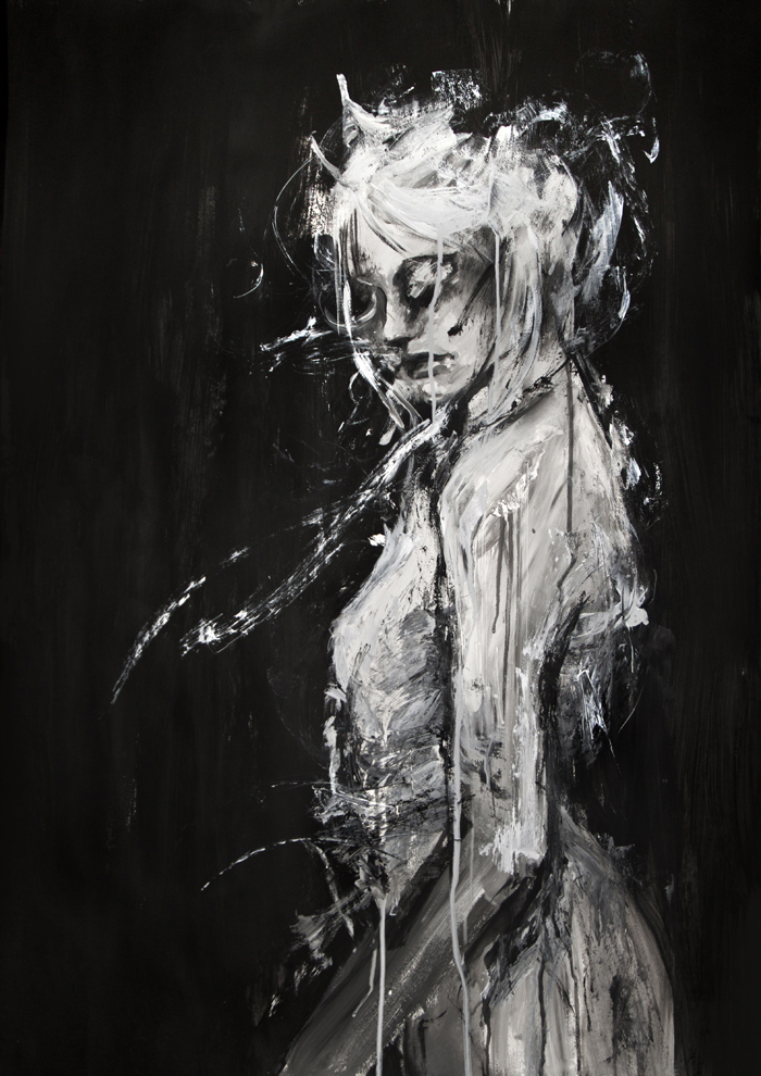
Now this is an amazing piece. The first time I looked at it, it registered as merely an impressive traditional painting. However, the more I look into it, noticing the motions, the details, and shapes, the more I am drawn into it.
The use of black and white, which I am generally not too fond of when using such media, works perfectly for this piece. The simplicity, minimalism even, of the concept, also leaves little more to be desired.
I have to say, I am very impressed. You clearly have an excellent grasp of anatomy and a solid base of realism, but you also have vision, and a lot of imagination. You manage to bring a poetic, dream-like quality to an an otherwise unimpressive subject, giving it a power that draws in the eye.
The little details, splotches, lines, drops that trickle down, do not only seem deliberate, but also perfectly placed, as if, had they been placed in any other way, the whole thing would have been ruined. They give the painting a feeling of chaos, of casual, passionate creativity, and yet they seem strategic and meticulous.
I only have a very, very tiny and ridiculous complaint. Exactly behind deepest curve of the female figure's back, the grey strokes of the backround seem a little forced. I think the reason is that both the level of her hips as well as the level of her armpits, this grey strokes seem to be trying to cover "mistakes", areas of lighter grey. Due to that 'effect' of being framed up and down by lighter grey, they stand out too much. They almost feel like they've been added after the whole thing was finished, to cover something up.
Anyway, that's just nit-picking, and me being an annoying bitch.
You have real, ground-breaking talent. I am looking forward to giving you five stars in the future, because I am sure that sometime soon you-are- going to paint something that will blow our minds completely.